


November 9, 2023
How working memory theory can relate to UI design
Among other things, we tend to measure the quality of a UI (User Interface) design around its layout, regarding easy-to-distinguish functional groups and clear hierarchy as signals of a pleasing user experience to come. Conversely, we tend to judge UI designs with disorganized and unintuitive layouts (e.g., lack of hierarchy, alignment, and meaningful groupings of elements) as having a poor design and likely a poor user experience. While design principles of alignment, functional grouping, and hierarchy give us rules of construction, they do not necessarily tell us when to stop building. However, there is a theory in cognitive psychology that the short-term or working memory can hold a magical number of seven, plus or minus two pieces of information. Perhaps we can add this theory to help us determine when to stop adding to an interface.
Like most heuristics, applying this idea is not black and white. The theory itself shouldn’t be accepted as an objective fact as there are competing theories and models of how people process information. For example, we will use “working memory” and “short-term memory" throughout this article as equivalent terms, although they are not always considered so. Moreover, numerous variables can impact working memory, such as a person’s inherent cognitive ability, training, and context (e.g., stress during a scenario). Despite the subjectivity, we still have to consider what constitutes information overload when we design a medical device UI. The 7 +/-2 rule of thumb, could provide a stake in the ground from which we can orient our judgment. But, how exactly?
Ways designers deal with the perception of information
An example of how we can accommodate our working memory can be illustrated with a string of seven numbers, such as 7 2 1 9 4 5 3. If we “chunk” the numbers into 72 91 453, or even 729 1453, they presumably become easier to process and remember than the seven separated digits. There are also theories related to the modality of information - for example, that a user can process a cue containing visual and auditory information more easily than two cues of the same modality. Therefore, the differences in human capabilities and how we present a piece, or chunk, of information make our 7+/-2 pieces of information quite malleable. In other words, designers are not simply relegated to only 5 to 9 buttons, or 5 to 9 labels, or 5 to 9 graphics.
One way designers will try to reign in this ambiguity is by evaluating a design in terms of its “First read, Second read, Third read”:
• “First read” generally equates to the gestalt impression; what is the system comprised of and what is the primary message being conveyed (e.g., the status of the system, DANGER!). When we look at a car, our “first read” might process the wheels, main body, and some windows, thus triggering our association of “car” based on three easily discernible chunks.
• “Second-” and “Third-read,” as you might imagine, would then describe increasingly subordinate information that draws the user’s attention upon closer/longer interactions, WITHOUT distracting them during the previous “read.” In the car example, during a “Second read,” we have time to determine how many doors there are and which one we should open.
Using chunks to reduce a UI design's cognitive burden
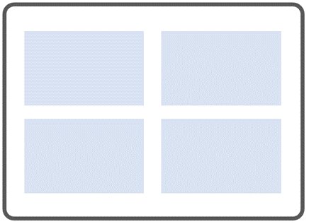
Considering this, we should try to throttle the demands on users’ working memory appropriately so that they perceive the UI in terms of a manageable number of chunks that align with the priority and urgency of actions they might take. For example, here is a description of a UI with 4-chunks (a number also associated with working memory theories) and their relative priority across our three “reads.”
1. Status – First read, assess the situation
2. Controls – First/Second read, alter the system based on assessment, quickly if needed
3. Parameters – Second/Third, gain more context, then see #2
4. Options and supplemental features – Third read, consider as time allows, and investigate additional conditions
Theoretically, the four “chunks” we established above could give the impression of simplicity with a layout like this:
However, theories of working memory do not replace all other design heuristics. Rather, we are adding a heuristic to help us determine quantity. In other words, in the example above, we were successful in the single heuristic, but I would argue the below example is more successful in the overall quality of the user experience.
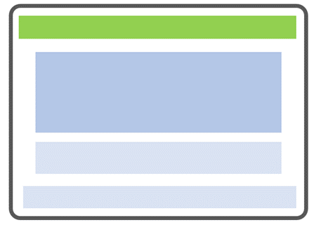
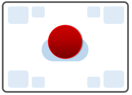
In another example, the primary control button(s), not the status, might be more effective as the “First read” because the user might assess the system status with their senses, not via the UI. Therefore, the UI must prioritize control selection as the first interaction. An emergency control layout might want to further minimize the need for working memory because stress can reduce cognitive ability. As such, the designers might want the design to appear to only have two chunks (even lower than our 5 pieces “minimum”) at first glance: 1) the emergency stop button and 2) everything else (i.e., equally subdued parts).
"Squint testing" UI designs
While the examples above are simple diagrams, the intended chunks you design will have to persist, and not dissolve, once the necessary details (e.g., labels, parameters, icons, graphics) are integrated into the UI. One way to do a quick check of the layout is with a “squint test.” Every so often, step back, look at your design and squint, then count how many “chunks” you discern. Ask others to do so as well.
Ask yourself and them:
-
Do the number of chunks seem appropriate given the scenario and user?
-
Do those chunks align with the areas and groupings you intended? Or are there too many things to target or areas blending?
-
Do your eyes move from one chunk to another in the sequence of hierarchy you intended? Or do elements draw your eye out of order, or too equally, inserting an unwanted decision into the process?
-
Does your layout, fully populated, accommodate your short-term memory, or tax it?
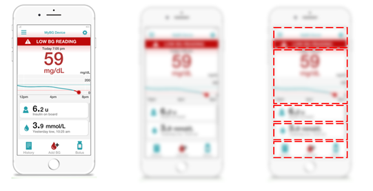
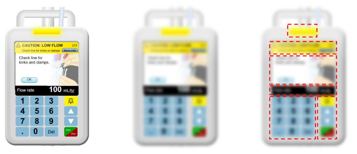
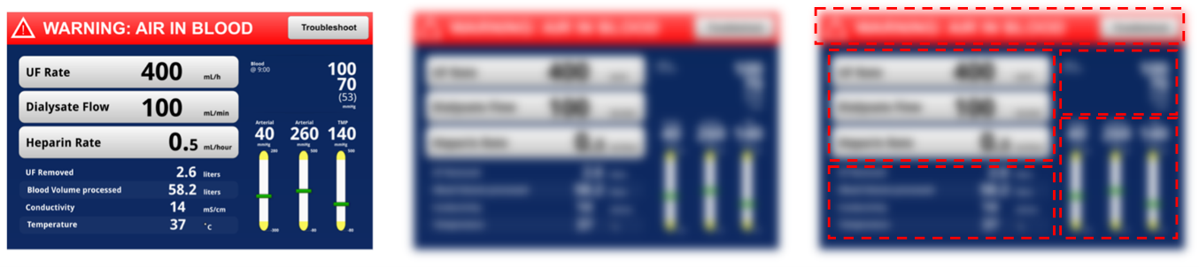
Below are a few artificially blurred images to illustrate the point. From left to right in each set is the UI, the “squint” view, and the outline of the intended chunks. How many chunks do you see when you squint at the first image in each set?
Key takeaways for UI design in 5 to 9
In the end, we would like to ensure that people can safely use a UI within the confines of their working memory during the precious moments of initial assessment and decision-making, targeting, and interaction. There will never be a single number of UI elements that work for every scenario, nor will the number of elements have the same effect on every person. Alongside other design tips for healthcare product developers, “UI design in 5 to 9” can be another heuristic to remind us that quantity matters in design layouts.
Here are a few more quick takeaways when considering this:
-
Reduce the number of pieces (visually or remove altogether) as urgency and criticality increase.
-
Contrast is your friend! Use greater contrast to separate chunks and reduce relative contrast (within reason) to draw objects together into the same or similar hierarchical order.
-
Conduct the squint test frequently on your layouts. Of course, this does not replace usability testing, but it can be helpful to test the basic perception of areas and hierarchy with people around your office.
- Evaluate with a high level of visual fidelity. Wireframes or early designs could give you a false sense of simplicity if they do not have the colors, graphics, text, and other details that might appear in a “final” design.
Cory Costantino is Human Factors Research and Design Director at Emergo by UL.


X
Request more information from our specialists
Thanks for your interest in our products and services. Let's collect some information so we can connect you with the right person.
Please wait…