


April 19, 2021
It seems like there is a new smartphone, mobile app, or connected device on the market every month. These increasingly “smart” mobile applications, dashboards, and connected devices often rely on icons to simplify the user interface (UI), save visual space, and communicate use-related information to users. This creates a specific design challenge because different user groups (e.g., adult patients, adolescent patients, nurses, physicians) have different experiences with technology and, therefore, might not understand the meaning of even some of the more common icons used today.
Many icons, even those we consider to be very common, can still be subject to misinterpretation because design patterns used in mobile interfaces and connected devices have only been around for a number of years and are not always used consistently. ANSI/AAMI HE75:2009, one of the leading guidance documents on the design of medical devices, recommends that symbols should only be used if they are commonly recognized by the intended user in a specific clinical setting (i.e., 85% of users identify the same symbolic meaning). Moreover, the US Food and Drug Administration (FDA) expects any symbol that represents information required by the US Federal Food, Drug and Cosmetic (FD&C) Act be from one a list of recognized standards. While this might not include symbols such as an “X” button for ‘close’, it could include many other important symbols that are expected to convey a consistent clinical meaning. That is why, as a general rule of thumb, providing a label with an icon can help avoid misinterpretation (i.e., providing a multi-coded interface feature). This requires us—as designers, researchers, and/or manufacturers— not only to understand any regulatory expectations and established device symbols, but also deeply consider our users’ mental models, even in cases of seemingly innocuous and common icons.
Common icons found in digital user interfaces
Below are some examples of four relatively common icons used on digital user interfaces. We’ll use these four icons to exemplify some considerations related to how users might interpret icons in the user interface.
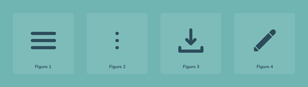
“Hamburger” icon
You might be familiar with the icon depicting lines stacked on top of each other hamburger style, aptly named the hamburger icon. The hamburger icon, shown in Figure 1 above, is used primarily as a menu to access system-level functions (e.g., system navigation, user log in/out, and settings). This icon is often globally present to enable users to access the menu’s contents regardless of where they are in the user interface’s workflow, but its function is not always clear to users. As such, users might have trouble locating information or functions that have been intentionally tucked away behind this icon, which can lead to frustration or even use errors. This becomes especially important when users must access the menu to complete critical tasks (i.e., tasks which, if performed incorrectly or not performed at all, would or could cause serious harm to the patient or user). To reduce the likelihood of such use errors, you might extract critical task elements and make them immediately visible to the user, such as with tabs or navigation panes, rather than options hidden behind the hamburger icon. In any case, pairing the icon with the label “Menu” can help users understand the icon’s function. As with all these examples, these are guiding principles, but your approach will vary depending on several aspects of the interface.
Vertical ellipsis
The close cousin of the hamburger icon is a symbol depicting three dots stacked on top of each other vertically. It serves a slightly different function than the hamburger icon, and is physically a bit more compact, so it is now lovingly referred to as the “veggie burger” icon (Figure 2). It also looks like a vertical ellipsis, so people refer to it as the “ellipsis” icon—more concise, but less tasty. The ellipsis icon is used for housing functions not appropriate for a global menu, but rather those functions that are more contextual to a specific feature or area of the screen. As such, the functions within this “sub-menu” can vary widely, potentially making it more difficult for users to predict its contents. Similar to the hamburger icon, users might incorrectly seek to complete a task by navigating to this icon - searching for a function to complete their task that might actually be located elsewhere in the application (e.g., on a different, or ‘next’ screen). Mitigating this error might require reevaluating the clarity of the intended workflow such that users do not seek to use this sub-menu rather than the intended function. Like the hamburger icon, it might also be benefitted with a descriptive label like “More” or “Account” depending on the information located behind it.
Download and import icon
Despite lacking a connection to food, one of the icons that has seen an increase in popularity as the connected devices industry has grown is the download and import icon (Figure 3). As devices and platforms become more connected, users can often import or download information into the application, which is where the import icon comes into play. In theory, this icon is quite logical with a downward or inward-facing arrow describing the flow of information, but not all user groups may have familiarity with sharing data. Like other icons, adding a label here can really help. For example, imagine a Bluetooth-connected oximeter is being used to upload oxygen saturation readings. In that case, a larger button on the connected app interface that reads “Upload latest readings” would greatly increase clarity. Alternatively, a well-placed addition icon (+) has shown success at directing users where they can “add” information or data. This can be another way to indicate the process of uploading information while still saving space.
Pencil icon
As we are making data entries and interfacing with mobile applications, mistakes can be made. We are only human, and technology itself is not always perfect, so sometimes we need a way to go back and edit this information. An icon commonly used for an editing function is the pencil icon (Figure 4). It is usually tucked in the corner of editable fields, added as a precursor to every editable field on the page, or is stored in a separate tab. Any of these options might lead to an unnoticed or ambiguous icon and/or a crowded page. There are several good techniques you might apply to avoid these issues. Consider including one or more conspicuous edit buttons with on-screen guidance that instructs users on how to edit fields (e.g., “Tap pencil icon to edit username”). Especially for applications that involve scrolling, another alternative is a floating edit icon with an accompanied “Edit” label. In other cases, an edit button might be rendered completely unnecessary if the fields are directly editable when a user first navigates to them.
Conclusion
These are just a few common examples. In actuality, using icons should be based on common practice, applicable standards and expectations, and critically, on feedback and input from your users (i.e., from research, usability testing). Each user group has different needs and experiences that we must accommodate to help support the efficacy, success, and longevity of our applications and devices.
Layne Hartman is Human Factors Associate and Ben Hannon is Senior User Interface Designer at Emergo by UL's Human Factors Research & Design division.
Additional human factors engineering and usability resources:
- Human factors design and prototype development support
- HFE user research for medical devices, IVDs and combination products
X
Request information from our specialists
Thanks for your interest in our products and services. Let's collect some information so we can connect you with the right person.
Please wait…
Characters remaining