


June 18, 2026
By OnKee Min and Rebecca Glasner
According to the World Health Organization, 16% of the world population, or an estimated 1.3 billion people, experience significant disability. The CDC defines disability as having three dimensions:
- Impairment. A loss or abnormality of body or mental function or structure.
- Activity limitation. Constraints performing an action or task.
- Participation restriction. Difficulty performing normal daily activities.
Given the diverse population of people experiencing disability, it is imperative healthcare providers, product designers and human factors engineers work to build a more positive and accessible experience for people experiencing differing impairments. Below, we discuss considerations for developing medical products for people who might experience one or more of four common impairments: those related to vision, hearing, cognitive, and mobility and dexterity impairments.
How can we design products and experiences for users with limited or no vision?
Vision impairments, such as blurry vision, central or peripheral vision loss and complete vision loss (i.e., total blindness), are considered one of the most prevalent disabilities among U.S. adults and children. Due to an aging population and rising rates of chronic diseases (e.g., diabetes), vision loss is expected to become more commonplace in coming years. Product designers can cater to these individuals using non-visual designs and multi-coding.
- Tactile and auditory feedback. Rather than relying solely on visual cues (e.g., pop-up screen), consider implementing texture, tactile (e.g., vibrate) and/or auditory (e.g., alarms) feedback.
- Multi-coding. Hyperlinked text is often colored in blue and underlined, which is a form of “multi-coding.” Often, color, text formatting and iconography can be used together to provide redundant cues to communicate with users.
- Distinct touchpoints. Consider using distinct button and control shapes and/or textures to communicate its function (e.g., right-pointing triangle to signify “play” or button with raised ridges to signify a touchpoint). Physical control design can also follow the principle of multi-coding, adding shape, color, texture and iconography into a control.
- Color contrast. Maintain a high contrast between text, images and background in all visual components. Bold colors may also be more conspicuous and colorblind-safe palettes help make all color-based information is accessible to sighted users.
- Text font and layout. To increase overall legibility, use sans-serif font (e.g., Arial, Verdana) and follow a logical, linear (e.g., left-to-right) layout with clear information hierarchy.
- Accessibility tools. Incorporate accessibility tools such as the ability to zoom, increase text size and/or a text-to-voice feature while maintaining the overall quality of the visual information (e.g., screen layout adjusts to zoom, text-to-voice reads accurately).
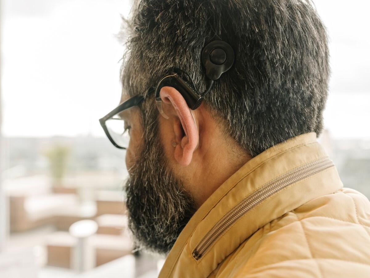
How can we communicate information effectively for users who cannot rely on sound?
According to the Pan American Health Organization, over 1.5 billion people worldwide experience some degree of hearing loss. Hearing loss and deafness can affect people of any age and can be caused by several factors, including but not limited to genetics, age, illness or exposure to loud noises. When developing medical devices, consider designs that do not rely entirely on sounds to make accessible products for people with hearing loss and people who are deaf. Some considerations for design include:
- Visual Cues. Rather than relying solely on auditory cues (i.e., an autoinjector click at the end of an injection), consider how to implement visual cues to inform users they have started or completed a task. Visual cues can range from pop-up windows in software, a light to indicate a product is ready for use or a color-coded dose indicator on an autoinjector.
- Physical feedback. Another consideration is haptic or tactile feedback on a device. Implementing feedback such as a click, snap (e.g., as components come together) or vibration, allows a user to “feel” that a device is working as intended.
- Closed captions and subtitles. As technology continues to make its way into everyday life, instructional and how-to videos have become a popular method to show how to correctly use devices. When creating videos to complement instructions, use closed captions and subtitles that are accurate and can be easily read. Consider how the background of the captions may impact legibility. Additionally, consider the speed at which the words appear on the screen. Notably, while AI is becoming a popular tool, it can make mistakes while transcribing content, so it is important to “proof-read” captions.
- Sign language interpretation. Another option for instructional and how-to videos is to consider including a picture-in-picture sign language interpreter. Some services, like the National Hockey League (NHL) and HBO Max, have started to include an American Sign Language (ASL) interpreter as an option while streaming because, unlike subtitles, an interpreter can capture more nuanced language and in many cases is considered more accurate and inclusive. Notably, if a product is marketed globally, multiple interpreters may be needed. For example, while the United States (US) and United Kingdom (UK) both have English as their primary spoken language, the two countries have unique signing languages, the US primarily uses ASL, while the UK primarily uses British Sign Language (BSL).
How can we reduce cognitive load for users with cognitive impairments?
Cognitive disability is a comprehensive term to describe conditions affecting mental processes including memory, perception, attention and comprehension. Examples of cognitive disabilities include learning disabilities (e.g., dyslexia), neurodevelopmental disorders (e.g., autism), mental health conditions (e.g., post-traumatic stress disorder) and degenerative diseases (e.g., dementia), to name a few. Due to the all-encompassing definition, there are several design considerations to accommodate users with cognitive disabilities. Some of these suggestions include:
- Simplify language. Keep terminology and sentence structure simple and straightforward. Specifically, avoid jargon, non-literal or metaphorical phrases and keep sentences short.
- Simplify layout. Present a clear hierarchy of headings and/or use bulleted lists to convey information. Incorporate plenty of white space to minimize visual clutter and sensory overload.
- Supplemental media. Provide multiple formats (e.g., illustrations, icons, audio, video) to convey information and offer text-to-speech tools so users can select the best medium for them. However, be sure that users can also disable any content (e.g., audio, animation) that might be unwanted or is overstimulating.
- Consistent GUI navigation. Reduce cognitive load by maintaining consistent navigation in graphic user interfaces (GUI) and incorporate features like breadcrumbs and descriptive buttons (e.g., “click to go Home” vs. “back”) to help users navigate.
How can we design for users with limited mobility and/or dexterity?
Mobility and dexterity impairments are defined as a limitation to the physical function of part of the body. Examples of mobility and dexterity impairments include tremors or involuntary movements, nerve damage, rigidity, slowness (bradykinesia), fatigue and weakness in or loss of limbs. The types of diagnoses that may experience this type of impairment are vast. Some can be temporary, like a broken bone, while others can be permanent, such as nerve damage or pain, arthritis, Parkinsons, multiple sclerosis, quadriplegia or amputation of a limb. Some common considerations are below:
- Stability and grip. Involve users early in the development phase to see how users hold, grasp and interact with a product. Consider testing grip strength as well as the force required to use a product (i.e., removing a cap from an autoinjector). Also consider where a user might expect to hold a device and if grips or grooves may be needed.
- Target sizes. Avoid relying on small exact targets; rather, use large and spread-out target areas. This helps users avoid selecting an incorrect area, whether that be a touchscreen button, physical button or interactive feature.
- Required motions. Similar to target points, consider how to simplify interactions required from the user. When performing a task, avoid forcing users to perform redundant or multiple actions or gestures and motions that require fine motor control.
- Adaptable tools. Consider when it is appropriate to utilize alternative tools when interacting with devices. For example, a joystick might be easier to maneuver than a mouse or a touchscreen, which may require more exact precision.
Inclusive and accessible medical product designs increase ease of use, and in doing so, support patient adherence and improve health outcomes. Usability testing helps to validate that designs are effective for your intended users. Contact our team to learn more about product design or usability testing. Or, sign up for a complimentary account with OPUS, our team’s software platform that provides HFE training, tools and templates to help you complete cornerstone HFE activities.
OnKee Min is a Human Factors Specialist and Rebecca Glasner is a Senior Human Factors Specialist at Emergo by UL.


Request more information from our specialists
Thanks for your interest in our products and services. Let's collect some information so we can connect you with the right person.