


May 1, 2025
By Alexandria Carlson and Jessica Wysor
The United States (U.S.) Food and Drug Administration (FDA) manages approximately 23,000 approved prescription drugs on the market, according to FDA’s office of Economics and Analysis. With so many drug products on the market, healthcare providers such as pharmacists and pharmacy technicians are called upon daily to differentiate drug products to confirm they dispense the correct drug and dose/concentration to patients. Furthermore, individuals in the U.S. are taking more prescription drugs than ever, according to the National Institute of Health’s (NIH’s) National Library of Medicine, and are consequently called upon to differentiate drug products even within their homes. It is imperative that drug labels are differentiable to help people take the correct medication with the correct dose and concentration. Color can be a critical aid in differentiation, yet it is important to use it wisely.
Five key considerations for selecting drug label colors
Below, we present 5 guidelines to consider when selecting drug label colors:
- Differentiate label colors from labels of similar products. Some medications are available in different doses or concentrations but might be stored near or next to each other on the same shelf in a pharmacy, medical setting or in a patient’s home. Individuals responsible for selecting the correct dose or concentrations should be able to readily differentiate the products. Visually distinct labeling, including label colors, can support such differentiation.
- Limit the number of colors used. To maintain clarity and ease of interpretation, use unique colors only when they support differentiation, usability and/or an intentional branding scheme. The ANSI/AAMI HE75:2009 standard recommends using the minimum number of colors for coding needed to make the information adequately distinctive. The guidance advises using no more than five colors when color coding across medication labels and fewer colors when possible.
- Consider implicit color meanings. Depending on the geography, certain colors communicate meaning. For example, in the US and Europe, red is associated with meanings such as “danger” or “stop,” whereas in China, red is associated with prosperity and happiness. While selecting drug label colors, manufacturers can reference Table 14.4 in ANSI/AAMI HE75:2009, which provides a breakdown of different color meanings by geography.
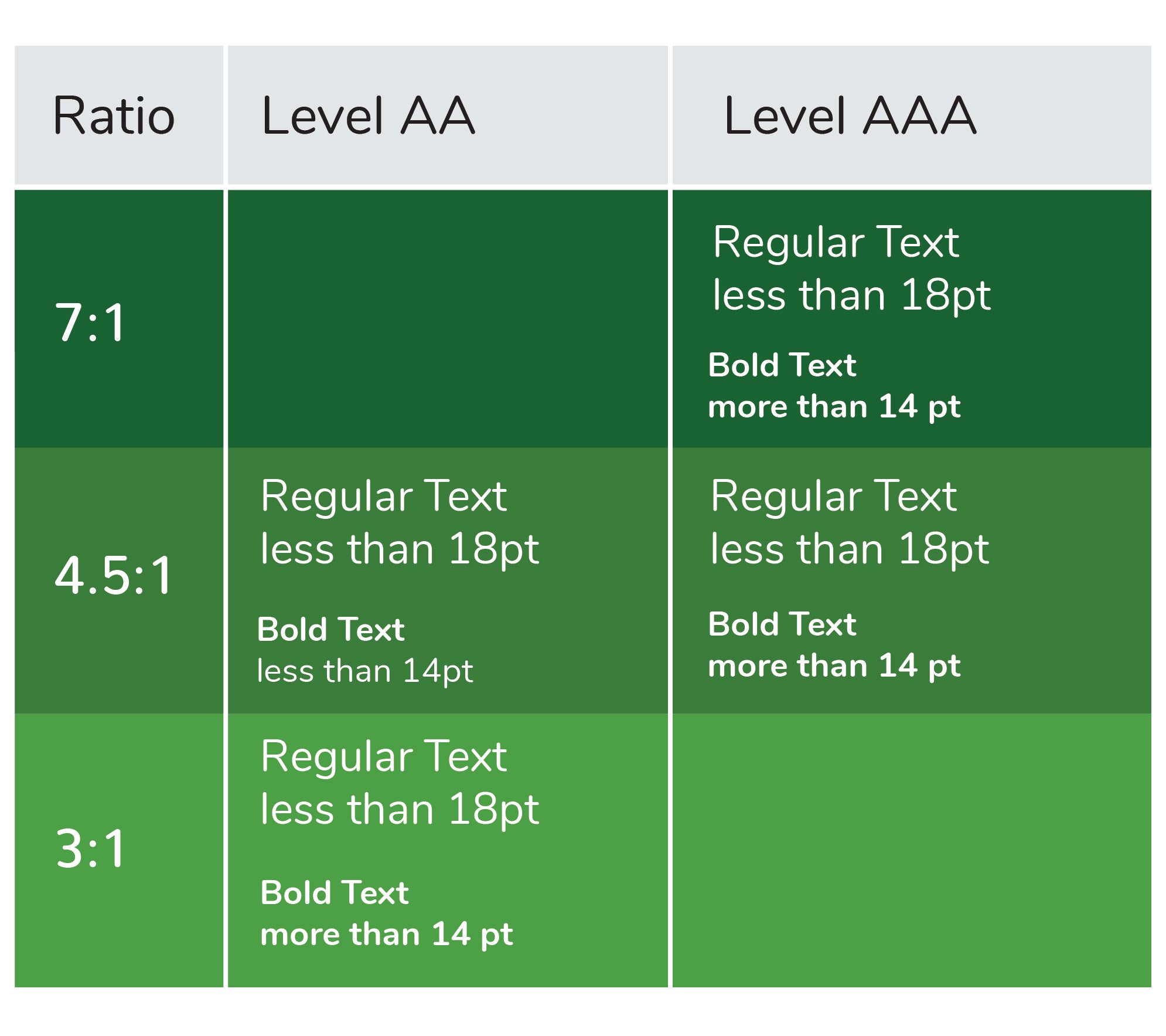
- Confirm colors are as visually distinct as possible. To create a cohesive visual brand for their products, a manufacturer might find themselves selecting label colors that are slight variations of a hue (what we consider “color”) and/or value (what we think of as the lightness/darkness of the color). This can create low contrast between those colors and/or between the color and any text overlaid on it, all of which can make differentiation more tenuous. Confirm overlapping colors (e.g., text on a background) have a minimum contrast ratio somewhere between a 3:1 and 7:1 ratio. The legibility of such text will depend on its size and font, but this range is generally a good rule of thumb to start.
Caption: Here is an image representing color contrast ratios based on WCAG guidelines
Additionally, certain vivid color combinations can be challenging for colorblind individuals to differentiate and can even be difficult for individuals without visual impairments; examples of such color combinations include green and red, green and brown and blue and purple. When creating medication labels, consider converting them into greyscale or testing them using a color blindness simulator to confirm information is legible and unique colors are differentiable for all users before finalizing the design.
- Avoid using color as the primary means of communicating essential information. While label color can be helpful in differentiating different medications, it should never be the primary means of differentiation. Drug names, doses, concentrations, and any other essential information should be written in reasonably large, sans-serif font with a high contrast to its background. Products could also be differentiated with color patterns, artistic shapes and/or symbols and images. This guideline aligns with Section 508 of the Americans with Disabilities Act, which requires information to be redundantly coded to support use by those with visual impairments. Furthermore, differentiating features that do not rely on color (e.g., color patterns and shapes) could support brand recognition and product differentiation.
Effective drug label differentiation improves safety and efficacy
Confirming drug label differentiation is essential to the safe and effective use of drugs by millions of individuals every day. While label colors can be a helpful design feature to differentiate drug products and create a visual brand, color should not be the primary differentiating feature between drug products. Important information such as the drug’s name, dose and concentration should also be sufficiently salient to differentiate drug products. In other words, information should be redundantly coded to support differentiation by all individuals, inclusive of their varying visual acuity.
Contact our team to learn more about product and label design. Or, sign up for a complimentary account with OPUS, our team’s software platform that provides a variety of design tools, including the Design Recommendation Library and Touch Target Tool.
Alexandria Carlson is a Lead Human Factors Specialist and Jessica Wysor is a User Interface Designer at Emergo by UL.


X
Request more information from our specialists
Thanks for your interest in our products and services. Let's collect some information so we can connect you with the right person.
Please wait…
Characters remaining