


November 20, 2025
By Tara Bates and Jessica Wysor
Combination products that integrate devices and drugs or biologics present unique challenges for manufacturers, especially when developing effective Instructions for Use (IFUs). Poor formatting, such as cluttered layouts or poor information hierarchy, can compromise usability, regulatory compliance and patient safety. A well-designed IFU can improve user comprehension, reduce cognitive load and support safe use, particularly for lay users. It also strengthens a manufacturer’s position during regulatory submissions and usability testing, noting the IFU is an important risk mitigation for combination products. This article highlights five common formatting mistakes and how to avoid them through best practices in human factors engineering (HFE) and document design.
Mistake #1: Unnumbered and Fragmented Instructions
Numbering steps in an IFU is essential for guiding users through tasks in the correct order. When critical actions, such as preparing for an injection, are placed outside of numbered steps, users may overlook them or perform tasks out of sequence. Likewise, over-splitting steps can fragment the flow of instructions, making it harder for users to understand the overall process and increasing the likelihood of premature or incorrect actions.
Common Mistakes:
- Avoiding step numbers to simplify appearance: While this may make the IFU look shorter and the product seem easier to use, it can compromise clarity and usability. Users may skip important tasks if they are not clearly integrated into the step-by-step flow.
- Over-splitting steps: Over-segmentation can make instructions feel fragmented and lead to premature or incorrect actions, especially when timing or sequencing is critical (e.g., lifting an injection too early).
Best Practices:
- Number each expected step: Use step numbers consistently, including for preparatory actions such as inspecting the device, gathering supplies or selecting an injection site, to ease your mind that nothing has been overlooked and to reinforce the importance of each task.
- Group related actions into unified steps: Present multi-part actions, such as injecting, as cohesive sequences to prevent confusion or premature actions. For example, steps like positioning the injector, pressing down and holding it in place should be grouped together to reinforce the full injection process. Use substep labels (e.g., A, B, C) to guide users through each part of the injection without fragmenting the flow.
Mistake #2: Inconsistent Visual Hierarchy
A clear visual hierarchy is essential for helping users navigate IFUs for combination products efficiently and understand what to do and when. These products often involve multiple steps, so users rely heavily on headings, lists and visual cues to stay oriented. When these elements are inconsistent or misused, users may overlook key steps or misinterpret timing, leading to potential safety risks.
Common mistakes:
- Inconsistent heading styles: Mixing font sizes, weights or formats across headings confuses users and disrupts content flow.
- Misaligned list formatting: Using bullets inconsistently or failing to distinguish between sequential and non-sequential lists can obscure task order.
- Inconsistent use of color: Applying color for emphasis inconsistently makes it harder for users to identify key information.
- Visual clutter: Overusing shading in illustrations, highlighting in text, or adding non-essential decorative elements can distract users and obscure important content.
Best practices:
- Use structured headings: Apply a logical heading structure (e.g., establish a Heading 1 style for main sections, a Heading 2 style for subsections) to guide users through the content.
- Format lists appropriately: Use bullets for non-sequential information and numbers or letters for steps that must be followed in order.
- Apply color purposefully: Use color to highlight key information or differentiate sections, not just for decoration. Check that all text and illustrations remain legible when printed in black and white or grayscale.
- Keep illustrations and formatting simple: Use shading in illustrations, highlighting in text and decorative elements only when they enhance instructional clarity.
Mistake #3: Poor Integration of Text and Illustrations
Illustrations are essential for supporting comprehension in IFUs for combination products, especially for users with limited health literacy or unfamiliarity with the device-drug interface. However, when illustrations are poorly integrated with instructional text, users may misinterpret them. For example, an illustration showing the plunger mid-way through an autoinjector’s viewing window without clearly linking it to the instruction to wait until the plunger reaches the end, might lead users to misinterpret the timing or prematurely end the injection. In combination products, where visual confirmation of dose delivery is often required, misaligned or unclear visuals can lead to incomplete dosing or user uncertainty.
Common mistakes:
- Illustrations are placed too far from the related step: This forces users to search or guess which image applies, breaking the flow of instruction.
- Illustrations are too small, cluttered or overly complex: When images attempt to convey multiple ideas at once, they become difficult to interpret and may overwhelm users.
- Illustrations lack clear labels: This makes it difficult for users to match illustrations with the correct instruction, especially when multiple images are used.
Best practices:
- Place illustrations immediately adjacent to the related step: Placing images adjacent to relevant text reinforces key actions, simplifies complex actions and supports comprehension, especially for visual learners.
- Design illustrations to demonstrate a single concept clearly: Each image should focus on one idea and be large enough to highlight the focal point.
- Label illustrations alphabetically in bold (e.g., “Figure A,” “Figure B”): This helps users quickly identify and reference images.
Mistake #4: Using Hard-to-Read Typography
Typography directly affects how well users can read and follow instructions. The FDA recommends using sans-serif fonts for all IFU text because they are easier to read than serif fonts. In combination product use, users should never have to strain to read instructions that directly impact safe and effective drug delivery.
Common mistakes:
- Using reverse type: White or light-colored text on dark backgrounds can be difficult to read, especially in low-light conditions or when printed in grayscale.
- Using condensed or narrow fonts: These fonts reduce readability and make scanning more difficult.
- Using excessive text effects: Bolding, italicizing and underlining can reduce clarity and distract from the message.
- Using all-uppercase body text: All caps slow down reading and comprehension, especially for longer instructions.
Best practices:
- Use clean, sans-serif fonts that are easy to read across print and digital formats: Fonts like Arial, Helvetica, Verdana, Calibri and Tahoma are widely accepted and highly legible.
- Make appropriate text sizing for different elements:
- Headings: 14–18 point or larger, depending on hierarchy
- Step numbers and key actions: 12–14 point, bold
- Body text: 10–12 point for print, 12–14 point for digital formats
- Maintain consistent font styles and sizes throughout the IFU: This helps users scan, understand and follow instructions with confidence.
- Limit text effects: Use bolding, italicizing and underlining sparingly, and only to emphasize key phrases or concepts.
Mistake #5: Folding Intersects Instructions or Steps
Folding design is often overlooked in IFU development, yet it can significantly impact usability, especially when instructions are segmented across multiple panels or pages. When critical steps are split between folds or require users to turn the page mid-task, such as during an injection, it disrupts the flow and increases the risk of error.
Common Mistakes:
- Segmenting sequential steps across folds or pages: Users should never have to flip the IFU during a critical task. All steps that must be performed in sequence should appear together on a single, uninterrupted panel.
- Placing content directly along a fold: Text or illustrations positioned on or near a fold can become distorted, hard to read or missed entirely.
- Lack of fold indicators: Users may not realize the IFU is not fully unfolded, potentially missing important instructions hidden on exterior panels.
Best Practices:
- Design for uninterrupted task flow: Check that critical sequences, especially those involving timed or precise actions, are presented on a single side or panel.
- Avoid placing key content on folds: Position instructions and illustrations away from fold lines to maintain clarity and legibility.
- Include clear fold indicators: Use visual cues or text (e.g., “Fully unfold to continue”) to show users when additional content is hidden. Conduct usability testing with folded IFUs so users can easily access and follow all instructions without confusion or interruption.
Examples of IFU Formatting Issues:[JW5]
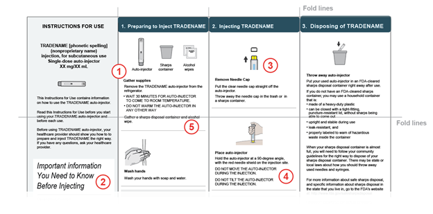
- Unnumbered and Fragmented Instructions: Lack of step numbers to indicate sequential order.
- Inconsistent visual hierarchy: Inconsistent heading styling, different font sizes and styles are used for heading across IFU
- Poor integration of text and illustrations: Illustration is very small and details are difficult to see.
- Using Hard-to-Read Typography: All-uppercase body text reduces readability and slows comprehension.
- Folding Intersects Instructions or Steps: Important warning text is placed directly on top of a fold line.
Designing effective IFUs for combination products requires more than just listing steps. It demands thoughtful attention to how information is presented, structured and visually communicated. Typography, visual hierarchy, step sequencing, illustration integration and folding design all play critical roles in guiding users through safe and effective combination product use. When these elements are poorly executed, users may misread instructions, skip essential steps or misinterpret device feedback leading to incomplete dosing, misuse or safety risks. By avoiding these common mistakes and applying human factors principles, IFU developers can improve user performance, enhance safety and strengthen regulatory submissions.
Contact our team to learn more about developing IFUs for combination products, or sign up for a complimentary account with OPUS, our software platform that provides a combination product IFU guide and ready-to-use templates for pre-filled syringes and autoinjectors.
Tara Bates is a Human Factors Specialist and Jessica Wysor is a User Experience Designer at Emergo by UL.


Request more information from our specialists
Thanks for your interest in our products and services. Let's collect some information so we can connect you with the right person.